Careful of spoilers @legaiaflame; not everyone here has finished the original game. I’ve added [spoiler][/spoiler] tags around those clips you posted.
Sorry about that. I still don’t understand why they took out most of Wander’s expressions, or rather, replaced them?..If they used the original code as a base, why not just keep all of Wanders animations?
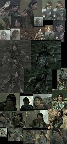
I found another compilation pick that compares how “wooden” the new Wander looks, compared to the original:
Here are some more comparisons/differences between PS2 and PS4 that show loss of atmosphere/art direction:

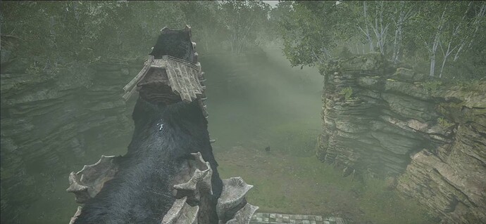
PS4 (The addition of more foliage, more flowers changes the atmosphere.)

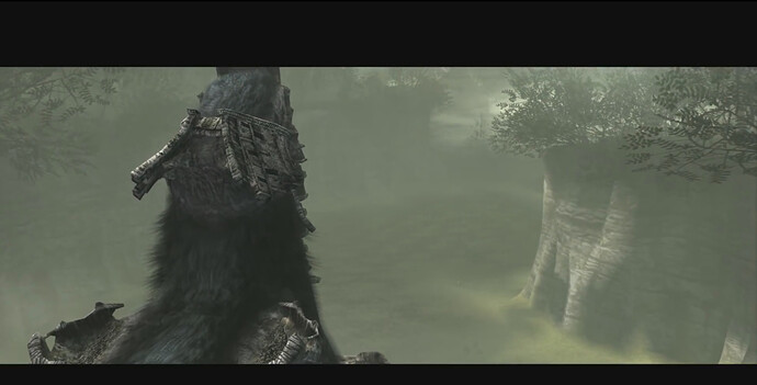
PS2 (The original had a mysterious haze or fog and felt more foreboding.)
PS4 (Wander appears stiff and missing expressions.)
PS2 (Wander turns his head properly and looks surprised.)
PS4 (Certain textures like the hair and stone look off.)
PS2 (The stone on the colossi appears more natural, less flat, and the hair looks more natural.)
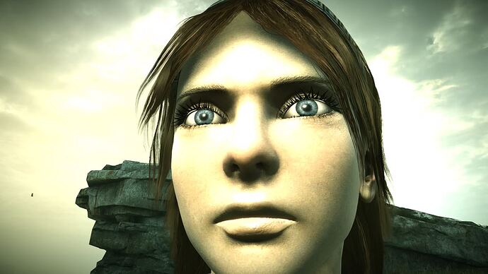
PS4 (Wander’s face appears unfinished? Also it appears Wander doesn’t get the small cuts or marks on his face anymore; after consecutive fights like he did in the original…)
I have finally played a good part of the game.
I am at the 15th colossi, and I had to interrupt the fight as this 15th colossi final blow drove me mad (which doesn’t happen often in a game).
So I don’t have the knowledge you guys have of the original PS2 version, or maybe the PS3 remaster to compare them.
I played this PS4 remake as my very first diving into this game.
With no surprise, I find the artistic direction superb, the visuals are also amazing.
So even though I didn’t play the original PS2 version, it amazes me to think they were able to design an open world of this scale back then.
However, my experience has been tainted by two main things:
-
the camera is really too rigid to my taste. I understand they were very true to the original game but why not offering an option regarding camera behavior. I can understand the original players value how true the remake will be but for the others… it is REALLY painful. You cannot rotate the camera while riding your horse. I mean the way they ‘magnetized’ the camera (hope this makes sense) is way too strong. They could have added ‘weighting factors’ when coding this like if you want to rotate the camera, it is quite easy and the camera only comes back to the horse move direction after 3 seconds something like that.
In short, they designed a gorgeous open world but you cannot really enjoy it.
I have been used to explore open world in recent games like Assassin Creed Origins, Horizon Zero Dawn, Zelda BotW to name a few, and it was always a pleasure to be able to control your horse with the left stick and the camera with the right stick. Here it feels so painful. -
the gameplay/controls:
there is a an option for so called modern controls. I haven’t tried the original ones but… these modern controls felt painful at occasions as well. Not always but during some phases, especially during this 15th colossi. Maybe that’s just me being very bad but I’m not sure…
I can understand one aspect of the game is figuring out how the weak spots and how to defeat the colossi but once you know what you have to do, gameplay should not really get in the way.
For this 15th colossi, I had almost defeated it (I don’t want to spoil here) and it took me a while to understand how I was supposed to end it.
But even once I knew, I just couldn’t finish the giant. I will have to give it another try but all this is leaving me with mixed feelings. I don’t play games to feel frustrated you know. The gameplay has to reward me sometimes (and most times straight away), I need to enjoy it. But here for me, it feels way too rigid overall. I mean it’s not the PS2 era anymore, I wish there were more possibilities offered to the player to enjoy the way he prefers it. Giving choices is never a bad thing for the player.
There is no doubt this game, especially the original release, is a masterpiece.
This remake is also impressing on different levels.
Here is a recent chat DF had with BluePoint to discuss all the tech behind this remake.
I believe this explains quite a bit about the gameplay.
Overall, the philosophy was to patch the original way the game was coded rather than coding from scratch.
I understand, and this is what probably offers the truest experience to the original.
But as said, I just wish they added different options regarding camera and controls.
EDIT:
“If the goal of Shadow of the Colossus’ remake is to recreate the gameplay of the original, it succeeds. But whether or not it actually captures the feeling of the original game is another matter.”
I haven’t played the remake, but one aspect of all Team Ico’s games that sets them apart from other action/platform games is the feeling of vulnerability. That has been - in part - conveyed through the controls. Wander isn’t necessarily a skilled action hero like Nathan Drake but normal human; making the actual gameplay “smooth” like Uncharted’s platforming sections would run counter to this, I think. It really should feel like a challenge to ascend the colossi, not just figure out how.
But, another aspect of the original SotC was the attachment you felt to Wander as a character and how you watched him struggle to achieve his goal.
The remake imo has failed to re-create Wander’s character. He is missing animations, isn’t as expressive as before and worst of all: he looks like a damn doll!
Team Ico was known for their animation as well as their design. When you subtract that from the only character you control, that is a big mistake.
I agree, this is the sort of philosophy I felt. Controls were probably thought & designed to translate this stuggle of Wander.
But to me, it feels more based on randomness than on a learning curve. I do not enjoy controlling Wander.
I somehow force myself finishing this game because of its legend…
If they bothered remaking the game and enhancing it visually, they could have given us alternative controls + camera settings via options. It never hurts.
This remake is aimed at a new audience as well and I’m not sure what these new comers think about the game. Every time I see someone complain on Resetera or twitter, hardcore fans seems to be bashing them… hard to have a discussion… And when I say complain, I could say ‘pointing aspects they consider weak’, it’s opinions, there are several…
Well, seems you wanted the game more like the original, when I ask for some changes but on different levels.
As said in the DF Bluepoint interview, I guess it’s hard to please everybody.
I thought that the remake already included two control schemes? It sounds like you want a third control scheme that is even smoother.
There’s a chance that changing the controls significantly much would also make those controls feel generic. So it might hurt in that regard (if some of the uniqueness of the game is lost). I realise that some people like to have a lot of options and the ability to tweak a game so that it feels familiar; I’m of the view that art is opinionated and is best when it doesn’t spread itself too thin my trying to please everyone.
I don’t know if this was possible as they used the original code when making the remake.
I don’t think it is so much to ask, to preserve what Team Ico implemented in Wander’s character.
Wander is the only character you play as. You are along the journey with him and become attached to him. In the original he had a certain look to him. He had certain animations. These animations showed his emotions: looking surprised as he ran from Colossi, getting small cuts on his face, his hair swaying as he ran and most importantly: showing more emotion and expression during cutscenes.
The remake lacks many of these important factors that allow you as a player to feel connected to him. Key animations are missing and he just looks lifeless and stiff!
I don’t usually tweak my games much. But if you introduce a new feature/control scheme, you’d better make it useful. Why did they introduce this new control scheme? For newcomers…
So I wouldn’t ask for a third scheme. I just think the existing so called ‘modern’ control scheme is not modern enough.
And to be perfectly clear, I don’t think the actual scheme is the problem here. But maybe when the player decides to use this modern scheme, the level of randomness behind should be reduced. This randomness is not something you control. It is no directly linked to the scheme but choosing the modern one should mean something.
I mean basically: you either are a fan of the original game and expect the game to behave exactly like you remember it or you are new to the series and expect something… responsive.
I get it that you have to hold a button to grip the titan, it makes sense. If you make a mistake and release the key, you fall… it makes perfect sense. But I still feel there is too much randomness.
And this camera 
I cannot even simply enjoy a ride on Agro when there is no battle…
EDIT: For instance, I would have loved to take a lot of photos given how beautiful the game is but I just cannot make the compositions I want due to this camera.
I guess it is always possible to tweak things by adding factors here and there but yea it is a matter of time and money involved in making these. I cannot say if they could reasonably do it but I was describing how frustrating this game made me feel. Which is not something I expected for such an ambitious AAA remake.
I get it, you know the original game which I don’t. So I don’t have those references to compare them.
But it makes sense. And it is true that Wander looks a bit emotionless in this 2018 game.
I think it’s meant to be realistic - e.g. even if you grip something, if you’re being shaken, there’s a good chance that you’re going to fall off, regardless of how you respond. The Last Guardian has a large degree of this unresponsiveness too; the creature Trico very often doesn’t obey your commands and has a mind of his own. Team Ico games are very organic in that regard, it’s part of their DNA to not provide a purely mechanical experience.
I have yet to play the remake, so perhaps someone who has played both versions can comment on whether the new control scheme is different enough that it was worth including?
From what I’ve heard, it seems they just changed the button layout. For instance: X being jump now instead of Triangle. And other similar changes.
To be honest, the actual grip command didn’t cause me too much trouble. I made it to the 15th colossi.
What drove me mad is when you are supposed to finish this 15th colossi with a final blow at a specific point.
To reach it, you have to climb on top of the giant and let yourself fall then grip, fall/grip… this section felt so stupidly random in the way Wander succeeded or failed to grip…
But again, if they added an option for the camera not returning to center/neutral position, it would probably save a lot of frustration.
Is it true in the original the camera was not returning to center or you could disable this ?
I agree with all of this. Now I’ve finished the game I can see how it would’ve been so impressive back in the day. That’s not to say I didn’t find it impressive nor enjoyable, it’s just that the controls and camera are so awkward by modern day standards.
It’s easily the most beautiful game I’ve ever played. The section on the way to I think it’s colossus three, with the waterfalls and cliffs and trees was simply breathtaking. Its just that the camera makes it so hard to properly enjoy these environments that you’re travellling in because you can’t just… Look… At something easily.
Once you get a hang of the new controls its not so bad - based on what I’ve read here they definitely seem to be better than the old ones. There isn’t much of a learning curve to them, but as mentioned they seem unreliable. You can do the exact same thing twice but Wander will move off in a different direction each time. It’s not game breaking, just frustrating; especially during the last few colossi…
The story intrigues you in the beginning, and disturbs you by the end, but the middle is devoid of story which I think is one of the game greatest strengths. Here you are, in this stunning but empty open world, going about your business with just your thoughts to keep you company. It just gave me time to think, what am I doing, who is Dormin, where am I, etc etc.
Overall I had a great time playing SotC for the first time, and I’m glad I played this version in 2018 rather than attempt the PS2 or PS3 versions. However, I think the game was probably most enjoyable if played back when it was first released.
I’m glad you enjoyed finally playing through the game, @UrbanReflex of the Colossus. The Last Guardian is still fairly new, so perhaps play that next? It very much feels like the successor to Shadow of the Colossus even though the two games aren’t explicitly linked.
I was actually considering playing Ico next, although I have my concerns about how well it’ll hold up in this day and age.
That and Bluepoint Games have said their next project is also a remake… Could it be…?
Ico? They’ve said their next project is “a bit bigger”, but Ico is definitely a smaller game than Shadow. And it seems a bit too soon for a Last Guardian remake. So I’m guessing that it’s unrelated to these games, probably something more mainstream that a publisher could justify remaking.
If you’re going to play Ico, the PS3 version should be fine. I don’t think it would benefit from a remake as much as it’s successor. It’s not a technically demanding game like Shadow of the Colossus, much smaller in scope.
It defaults to a new control scheme, but the option still exists to play with the original controls. I prefer playing the old way with the two button roll though. Old habits.
That pic legaia posted with the lack of fog…yeah I hate that. I’m very attached to fog and draw distance limitations/effects in videogames. It’s what made games like Silent Hill 2 or Tomb Raider (1996) so impactful for me. Atmosphere is just everything in games for me.
If someone in the forum would like to gift me a PS4 pro and with Sotc, I’d be happy to play this game again.
I finished playing through the remake of Shadow of the Colossus (on Normal difficulty). I’ve now played through the game three times, one playthrough of each version (PS2, PS3, and PS4).
Despite the visual changes we already know about, this remake really is a faithful rendition of the original. It brings back that feeling of playing the PS2 original all those years ago, of being an uncared for participant in a desolate world, a place can be a struggle to exist in, that will not lead you by the hand. And for that, the remake can be praised, I think. It would have been very easy for someone to decide to add extra dialogue, waypoint markers, more happening in the world, etc in order to “modernise” it. This still feels like Shadow of the Colossus.
The remake is perhaps a little too similar to justify replaying it. At many points I was thinking “this looks really nice” while simultaneously thinking “been there, done that”. So for those who have played either the PS2 or PS3 version, maybe hold off buying the remake until a sale. Since I’ve played the game three times now it will likely be a long time before I play any version of Shadow of the Colossus again.
Visually, some of the criticisms mentioned earlier are valid, but it also does not distract from the experience when the game is in motion. You have to think of this as an alternative rendering of the world. And it does look really good, one of the most visually impressive PS4 games around. But if you only played the PS4 remake I encourage you to watch at least part of the PS3 version on YouTube to see what you’re missing out on. Some of the minimalism and abstractness of the original visuals have been lost in the remake, while other things have been enhanced. I’m glad the game was remade though, since many people would overlook the PS3 version for looking “too old” otherwise.
I’ll comment briefly on the controls and camera. There are a number of different control configurations, but they’re basically just button remappings. I ended up with a control setup similar to that of the PS3 version. Wander stumbles around, as a vulnerable young man would in the presence of a colossus. It’s not effortless Uncharted and it shouldn’t try to be. The camera, while annoying at times, represents the viewpoint of a person temporarily glancing up at the colossus while running away; such an act would be temporary. It’s not supposed to be smooth, it’s supposed to feel like a struggle. So I’m glad that these parts of the game weren’t changed. I had no major frustrations finishing the game, even though it’s been a few years since I last played it (although that last colossus always proves to be a challenge).
Overall, the remake gets the thumbs up from me, as a fan of the original. I realise that gamers used to modern controls will likely call the game flawed or not progressive enough, and in many ways I can understand that. Shadow of the Colossus was a game of it’s era, and it’s unlikely anyone will try to make a game like it again, because games are expected to be effortless these days. I’m okay with that - it is what it is in the history of video games - but I hope that future games can continue to learn from it’s implicitness, minimalism, and focus.
I also found an easter egg that wasn’t in the original game. In the forest area you can enter an underground cave and find one of the barrels that you feed to Trico in The Last Guardian, surrounded by those blue butterflies. This probably isn’t an explicit link between the two stories, but my imagination likes to think so.


