Please paste your constructive criticism of the Panzer Dragoon: Remake footage in this topic for the developers to look at. Since they are very busy working on game, please be a concise as possible. Off topic posts will be deleted.
Also keep in mind this isn’t the place for big feature requests, but suggestions on refining the existing game. The game is already far along in development, with the aim for Winter release. However, even if they don’t have time to implement many changes in the first remake, remember that Zwei is still in pre-production.
I have collected and curated the criticism from the Forever Entertainment Discord server below:
Draikin 06/12/2019
Nitpicking about the trailer: the dragon’s roar is very distinct in the Panzer Dragoon, so it’s really odd to hear a more generic roar at the end of the trailer. I hope they can just bring back the original sound.
Draikin 06/12/2019
A second point of feedback; the holes in the dragon’s wings are a bit weird if you consider that the Blue Dragon is essentially the ultimate weapon of the Ancient Age. Unless there’s a story element to that.
The dragon in Panzer Dragoon Orta was (probably intentionally) “imperfect” in comparison, it had become more of a “regular” dragon than the living weapon from the first three games.
Lucid 06/12/2019
And seriously, you should watch those vids. If there’s one thing I want to always make sure, easy with the bloom. It can hurt more than help at times.
Saturn Memories 06/12/2019
The only thing I didn’t care for was the constant wind-whipping effect. I feel like it should be used sparingly. Or only if there’s a speed-up command like in Orta.
Other than that, everything looked good.
Draikin 06/12/2019
One other concern I’ve heard from fans is that the initial area looked rather “lively” in comparison to the original. The original trilogy on the Sega Saturn had a particular color palette that really fit its desolate world.
cucholix 06/12/2019
Not sure if it has been pointed out but the camera would be closer to the dragon, or make the distance adjustable
Solo Wing 06/12/2019
Long time Panzer Dragoon fan here (I run the Panzer Dragoon Legacy fan site). I’m quite concerned with the overall colour palette and brightness we saw in the trailer. Especially the orange in the blue dragon’s wings, they look almost fluorescent. The Saturn Panzer Dragoon games has always used less prominent, earthly tones; this defined the look and feel of the Panzer Dragoon world.
GehnTheBerserker 06/12/2019
Huge PD fan here. My initial gut reaction to the trailer was a bit uh oh on the visual style…having watched some footage a couple times more it’s growing on me.
But a couple of concerns :
1 - speed of the aiming reticle; it looks a bit slow, the originaly PD1 didn’t have the best feel to the aiming, specially when compared to Zwei’s (miles better)
2 - the gun fure and aiming effects look flimsy, like they pack no punch and the watery-transparency look to them should be toned down; there should be more “white light” to them
3 - at times the camera seems to zoom out too much and the dragon is too small on screen
Overally I’m cautiously excited, but I see a lot of other details that would benefit from tweaking
Draikin 06/12/2019
One other small thing: it would be nice if the developers could add a slider to configure the motion blur. Some people get sick from motion blur, and it really helps them if they can disable it.
PanzerKyle 06/12/2019
Please don’t take this the wrong way because we all know hardcore fans get upset at the smallest changes and can be uber nitpicky at times, but I think many of us believe that the visual style doesn’t capture the original art direction at all.
The Panzer Dragoon series were games that looked like no other games that came before or after them and had an incredibly unique style, atmosphere and art direction. It mixed natural and technological elements and had a Turkish/Ottoman feel to it as seen from a Japanese perspective. There was a little of Nausicaa, a little of Moebius, and a little of Dune, among other influences. There was also a certain simplicity to it, with those characteristic thin black lines over white rocks, and levels are also relatively simplistic and barren due to the Saturn’s limitations, which was part of the game’s charm and contributed to the overall feel. The enemy designer got inspiration from “antique clocks and various industrial products from the era of the industrial revolution for mechanics, and myriapods, marine mollusks, ammonite, and a rusty fishing boat”, and it clearly shows in the bio-mechanical creatures he created. You can look at a random screenshot without the dragon and immediately recognize the world and its inhabitants.
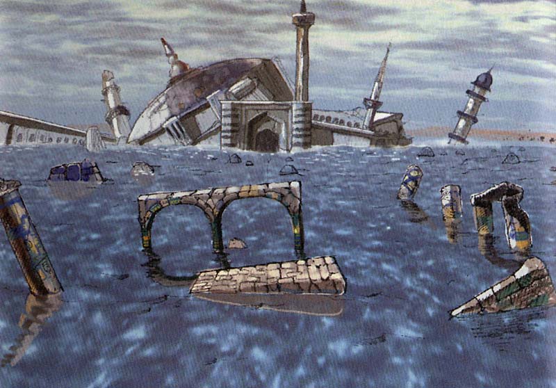
The first stage in this God-forsaken world was a flooded city. This flooded city: https://www.panzerdragoonlegacy.com/system/pictures/822/original/panzer-dragoon-episode-1.jpg?1483099264 An endless desolate blue lake with only a few remains of a long-forgotten civilization that has now become kind of a generic lake with rocks everywhere that would make no sense in the middle of a city. Has anyone at the studio wondered how this city would have looked before it sunk into the lake? Is this a layout that feels real, or just a collection of identical buildings and pillars copied and pasted ad nauseam on little rocky hills that were nowhere to be found in the original? Were those symbols at the end of the gameplay trailer in the Saturn game? What do they mean and why are they repeated four times? Does everything respect the lore and the atmosphere of the series?
In my opinion, they’ve gone overboard with some elements while completely missing what made the original atmosphere so unique, to a point where the art style is overdone and even a little tasteless. It looks cartoony and reminds me of a well-made mobile game or even a PS3 game from that time when every developer added a brownish or yellowish tint on top of everything for the sake of “realism”. And since the dragon is flying really fast all the time, let’s draw speed lines because if we don’t, people will think our game is slow and boring. Oh, and what if we add holes to the dragon’s wings because it adds more realism or whatever? Yeah, let’s do that as well. More details = better graphics, am I right?
And it’s not just the art style that feels wrong. Remakes, by their own definition, are bound to change a lot of small things, but… what the heck was wrong with how the lock-on and lasers sounded in the Saturn games? Do they sound “old” to any of you and thus need to be replaced? Imagine they had changed the most iconic Star Wars sound effects in the new films and now the lightsabers sounded like an electric shaver. Well, that’s what’s happened to Panzer Dragoon, so get used to your dragon roaring like any other generic dragon ever.
I realize this is just the first trailer and some things are going to improve. I know the team are trying their best to replicate the gameplay and want to create a beautiful game with the budget they’ve got, but I hope they remember that his series holds a very special place in the hearts of many Saturn fans. Panzer Dragoon wasn’t just another rail shooter, it was a game series that absolutely defined a beloved console, and I think one of our biggest concerns was that this remake wouldn’t capture the original’s aesthetics… which sadly seems to be the case at its current state. I just hope the developers realize the art direction is not what many fans are expecting from a Panzer Dragoon game and try to make it as faithful to the original as possible. I know I come off as an overly critical fan and many of you are happy with the remake’s overall looks and probably think that I’m exaggerating, but I really want this game to be good, I definitely want to buy it and I want it to sell well and to be followed by its sequel.
Fingers crossed…
Saturn Memories 06/12/2019
the greco-ottoman architecture is there
although they might have went a bit overboard with all the minarets
Bowm4080 06/12/2019
For me personally, everything is kinda too cluttered.
For a more recent example, Orta doesn’t really have too much crazy stuff going on from what I can remember.
Bowm4080 06/12/2019
If I could change anything is maybe make the valleys a little less grand? I always thought of the opening stage as a vast ocean
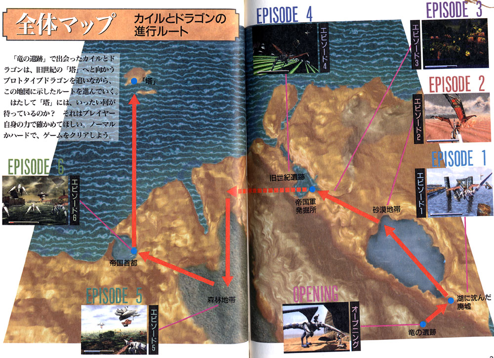
And yes, the barrenness of the Saturn Panzer Dragoon games was very much intentional and part of Team Andromeda’s vision. As you can see from the map, most of the known Panzer Dragoon world is desert.
Solo Wing 06/12/2019
The lore is basically that the Towers purify the air, water, and soil to enlarge the number of habitable areas, but over time they are not functioning as they once did (or were intended to).
Lucid 06/12/2019
I don’t think people are asking for 1:1, I’d say people are asking for something faithful. Creative interpretation is always a neat thing, especially with new hardware, but it’s best to not go too “creative” to the point of just being different
Bowm4080 06/12/2019
Watched the trailer again. The hills here make me think of Gaur Plains from Xenoblade Chronicles instead of Panzer Dragoon
I guess if I had to sum it up… It looks too good for the post apocalypse.
Bowm4080 06/12/2019
At the very least, a color palette to match the original would be enough imo
And a 20fps lock for ultra nostalgic purposes xD
Tempest 06/12/2019
I love how beautiful Megapixel Studio have made the graphics. I never imagined the game would look this good. Thanks for the great work.
However, the sound effects sound off too me. Lagi’s (the dragon) roar was never really a traditional roar as it is at the end of the promo video and more of a screech (listen to any of the original games). Further, the dragon’s laser effects sound too mechanical given that they come from the dragon, which is an organic life form. I hope they fix this in the final release,
Ves 06/12/2019
The scream of the dragon is wrong. Let it sound like the original one (much higher). This is an important point for recognition. Otherwise it looks so far very good, great work. Greetings from Germany
Solo Wing 06/12/2019
The aesthetics are really important to core Panzer Dragoon fans, arguably more so than the gameplay. This series came out in a time where most games didn’t take their worlds too seriously, with a few exceptions like Myst (it should come as no surprise that many Panzer fans were also drawn to that series).
Solo Wing 06/12/2019
By the way, it appears there was a Tower nearby the ruins in PD episode 1, which could explain why it’s less barren than surrounding areas. According to the Tower Distribution Map. Panzer Dragoon Legacy - Tower Distribution Map
natelawrence 06/12/2019
I’m glad that I’m not the only one who was concerned with the sound of the dragon’s roar / cry / voice.
See Draikin, PanzerKyle, Tempest, and Ves’s comments above.
And yes, after seeing the gameplay trailer, I would say the same for the dragon’s homing laser sounds.
Draikin 06/13/2019
I was reading @PanzerKyle’s post and I have to agree with the points made about the first level. After giving it some more thought, the level is supposed to be a submerged city, so all the natural rock formations aren’t really supposed to be there. The point was to just have a large lake with buildings and ruins sticking out of the water. That’s why the only thing you see in the first episode of the original game are remnants of buildings. I’m giving this feedback for what it’s worth, because I realize that the level is unlikely to receive major changes with this much work already being done. It does, however, make me a bit worried about the other levels.
MacroBlock 06/13/2019
The city being moved to a flooded valley I ahve mixed feelings on
it’s a change but at the same time I think the original decision to set it on a plane of water was probably driven by the Saturn’s VDP-2 layers and shimmer effects
MacroBlock 06/13/2019
I think ideally what they want to do with the 1st level is base it on reality in terms of the geography, many ottoman cities had rock formations around them… but without random rocks poking up out of the ground right next to buildings
PanzerKyle 06/13/2019 @Draikin Thank you. It looks like we’re in the minority, though. My main concern is that they may be making some questionable changes just because they look cool, without asking themselves if they fit the canon of the series or if they make sense. I don’t mind creative differences and I really don’t care whether the stage is set in the morning or at dusk, but the fact that the layout looks wrong and uninspired and the art style and the scale are so different has me worried. As you said, if the first level is already so different from the original, the rest of the game is probably going to follow the same path.
MacroBlock 06/13/2019
I think the aesthetic of the first level in the remake has too much rock formation near the buildings
Like in real life the valley a city is in isn’t litterally on the buildings typically
I’d expect maybe some rock formation suggesting a valley just poking up out of the water here and there
if it is trying to the imply the city was located in a valley
in the periphery of the camera/distance
MacroBlock 06/13/2019
At the same time, striking a balance between what is respectful to the original and what will look cool on screen is a very real line to tread - in a way it is necessary to change things, of course one thing that would be really cool is if you cold actually see what’s under the water in certain areas
like what if the entire city was visible through the water’s surface beneat shadows/from angles that block the sun
macabremonster 06/13/2019
Hey I was noticing some jerkyness with player movement in the trailer. I know it’s probably still WIP but just wondering if this was a design choice or that will improve later?
MacroBlock 06/13/2019
I wouldn’t be terribly bothered if it didn’t change, but in the saturn games the dragon always sounded like a sort of space-dog yelping or something when shot at/let out a screech-roar thing that was a little less jurassic park sounding
FilipeChaves 06/14/2019
1- The sound of the shots, both from the gun and the laser, are a bit off. Instead of sounding menacing and powerful like in the original games, they sound like something flimsy coming out of a child’s game. Please fix
2- When it comes to the roar of the dragon, you should not try to make it “realistic”. The dragon at the end of the trailer sounds a bit like a T-Rex and this is not the “feel” you should go for. Panzer Dragoon happens in an alien world with bio-engineered creatures. The original dragon sounds should be used as the basis for how the creatures squeal and sound like.
3- The art style also looks a bit off. The original artwork was inspired by French artist Moebius (you should look at some of his work or even try to contact some of the original artists from Team Andromeda). Overall, the game is looking too bright/shiny, and a bit too colorful. Lets not forget that although the current aesthetic may seem appealing, the fact is that Panzer Dragoon has a quite serious backstory and lore and it happens on a desolate landscape after the fall of the ancients. As such, the color pallet should be murkier to convey this feeling of being set on a post apocalyptic world.
4- The aiming reticle should be the one that appears on Panzer Dragoon Zwei. There was a reason why it changed between the two games The reticle from Zwei was quite an improvement from the first game. https://www.youtube.com/watch?v=Hy1w37DNPHg
4:27 thats how panzer dragoon Dragons should sound like
MacroBlock 06/14/2019
The tire-screech type roars of the dragon were kept in Orta too
although obviously new versions of the sounds
MacroBlock 06/14/2019
I would say some of the later stages were fairly vibrant though
color pallete on the first stage was basically pastel blues though
FilipeChaves 06/14/2019
Yes, jungles etc can be more vibrant and colorful, but ruins are definitely murkier (color pallet more around browns etc I would say)
MacroBlock 06/14/2019
well the ruins in the 1st stage themeslves on saturn were blue
FilipeChaves 06/14/2019
Yes, but not shiny
MacroBlock 06/14/2019
probably best to revisit some actual ottoman architecture for making HD versions of the ruins from PD1
MacroBlock 06/14/2019
So the roofs there are like blue tile rather than shiny metal like current game version
MacroBlock 06/14/2019
For me the color pallete itself doesnt bother me that much
I would say the orange rock formations rather than it being mid-ocean singking city change the atmosphere of the level considerably
FilipeChaves 06/14/2019
One must be careful not to change too radically. The point is, art from the first games was heavily inspired by Moebius, I think it should stay that way. The current style just doesnt look quite there yet
Shelcoof 06/14/2019
I have to agree with this assessment of the first level :
“(…) there was a lot of technical limitations at the time but I believe this level was designed this way on purpose. There are other levels in the game that are way more populated by assets than this one.
PD games are know for this specific kind of levels that are very “painterly” (for the lack of a better word) in which you see the horizon and a lot sky. This one of those levels. This not an “action” level, It’s not a dramatic level, it’s an “enjoy the ride” level. Just listen to the music.
I believe they missed that point. The way it is right now it’s not pleasant. It’s claustrophobic, I can’t see the sky, It’s packed with assets placed everywhere, the time of day is completely different and so is the mood.
The devs have plenty of levels to go crazy and I think they can look great, like the forest in Zwei for example, but sometimes less is more and this is one of those cases.”
The level is indeed looking too cluttered with assets. We need more of a feel of open space. Lots of ocean and lots of sky. Claustrophobic levels will come next (Tunnels of Episode 4)
MacroBlock 06/14/2019
I agree, the first level is too cluttered looking by comparsion
MacroBlock 06/14/2019
the paint over where there is still clutter of more “high def” looking ruins
is much nicer
it still looks like open ocean
the next level is a desert level
plenty of room for rocky clutter there
Maybe even a segway … ? Like between the water stage and desert stage, I think there may be room for some flooded valley
MacroBlock 06/14/2019
the fact you can see out to the horizon in the periphery in the re-paint makes all the difference
Since the motif is repeated in Saga, cities sinking into the ocean
Shelcoof 06/14/2019
Couldnt agree more
its not some random mountain terrain, its a whole city that got under the ocean pretty much. The openness of the original gives you a mixed feeling of calm while at the same time being shocked because you actually realize thats a desolate place.
JC Wesker 06/14/2019
I think we’re forgetting… Blue…
So much of the Theme of Episode 1 is simply… Blue…
The Ocean & The Sky…
It would be a shame to lose that…
MacroBlock 06/14/2019
well the paint-over is blue too
then the second stage, very much orange
I think the sunken city thing can be made visually appealing too though
Orta and Saga especially use vibrant colours and still portray the desolation of the world well
JC Wesker 06/14/2019
Sure the sparse Nature of PD was partly because of Saturn Hardware, but it also defined the look of the World… That’s why Orta maybe isn’t as visually appealing in some ways, because of that… ‘Clutter’ as many of you are referring to…
Shelcoof 06/14/2019
That right JC
I always felt there was something off with Orta and I finally understand what it was
That is the feeling ! Look at Uru ruins. Its sparse and desolate
Draikin 06/14/2019
Seems like a lot people share the same concern about the art direction. It’s good to know that the developers are taking the feedback seriously, as evidenced by their interactions on Twitter and Discord.
Aside from SotC, I’d say NieR: Automata also has a “Panzer Dragoon” aesthetic to it. Those are the two games that come in mind that I’d point to in terms of capturing the “desolate” world that we see in Panzer Dragoon.
Saturn Memories 06/14/2019
at the very least, the lighting should be tweaked. need less sepia, more blue.
Bohnson 06/14/2019
“players request nice and detailed backgrounds today.” - not sure that I agree. It’s about focus and balance, not filling the screen with as much detail as possible.
Since the background has the same level of detail, contrast and color as the enemies, they tend to be hard to make out.
I don’t think it looks bad per se, it’s alright - but I think it may be valuable to tweak the color grading of the background a bit, turn down the sepia, make it more blueish - that way the player, enemies and projectiles will stand out more, and the game would look more faithful to the original level.
MacroBlock 06/14/2019
there are pillars like that all over turkey etc
I don’t agree that gamers today simply expect as much crap shoehorned in the background as possible though
Detail doesn’t = stuff
Saturn Memories 06/14/2019
i don’t have too much problem with the flooded valley, but the lighting/color grading probably should be reexamined
Bohnson 06/14/2019
It’s important to capture the “feeling” of the IP. Desolate, dying world, “beautiful destruction”, post-postapocalyptic, endtimes… Moebius & Nausicaä. If everything is vibrant and full of detail, this feeling may be lost.
Solo Wing 06/14/2019
Regarding the city in episode 1, my personal theory is that the nearby Tower flooded the city to keep the rising population down. There was a similar story told in Saga about a town in Uru (also near a Tower). It’s possible that this was a post-Ancient Age civilisation that came and went sometime in the last 10,000 years.
Shelcoof 06/14/2019
Regarding the dev comment below. I dont necessarily disagree, but there is a time and place for everything. There are plenty of levels where you can go crazy with details, but Episode 1 of PD1 is not one of them. The feeling conveyed by the first game should remain. Another good example is episode 5 of Zwei which happens over a big lake. To clutter such levels makes no sense. However, feel free to go crazy with the forest levels etc.
“We had some feedback saying that we should remove backgrounds elements because in the original game it was only a big sea with almost nothing, but it can’t be our direction, as players request nice and detailed backgrounds today”
Solo Wing 06/14/2019 @Shelcoof I think it would be useful to show some examples of contemporary games that have succeeded and do follow a minimalist approach to world design. My two favourite games after Panzer Dragoon Saga are Journey and Shadow of the Colossus; that isn’t an accident. Also, I recently played Nier Automata and thought the world design and colours felt similar to Panzer.
Shakespeare 06/14/2019
The last guardian shouldn’t be counted out either
Shelcoof 06/14/2019
There is also a difference in terms of minimalism by intention vs minimalism by limitation. I think that in Panzer Dragoon, just like ICO, Shadow of the Colossus, Journey, etc, minimalist is intentional. Is all about the feel you want to convey to the player.
This is why I reiterate, there is a place for everything:
Certain levels should convey this mixed feeling of a desolate landscape thats is both calm and at the same time frightening because it makes you think (what the hell happened here?).
Other levels can be very detailed as they say. For example, episode 2 of Zwei. The overall canyon where you star the level is pretty desolate, but once you get inside the base where you witness the Empire forces fighting Meccania there is room to go the extra mile and add lots of detail to the base. People, ships, laser cannons, etc.
Shelcoof 06/14/2019
Its not either one or the other, its the right balance of both !
Shelcoof 06/14/2019
Furthermore, there is detail by exquisite polishing of the assets you already have in the level vs “detail by quantity” where you fill the level with stuff and call it detailed just because you can see a lot of stuff around you.
An example
Stop at 0:40.
Is the original one more detailed because you can see all of the features of that decaying old building? Or is the new one more detailed just because you have rocks everywhere (event though you cannot even see the arches anymore)?
Also, does it even make sense to have those rock in there ? I am also under the impression that the lore states, or conveys, that a tower raised the water level on this lake to finish off humans in that area. So how do you end up with that big solid rock in the front of the building anyway?
MacroBlock 06/14/2019
I think my main critisim of the buildings in the new one is they look a little pristine and shiny for something that sspposed to be a lost civilisation
like arch-vis renders
But it’s notthing some substance painter/3D coat couldnt fix
Shelcoof 06/14/2019
Yes Macro, the brightness/shinny feeling is also a bit off. Should be more muddy, dirty, murky. Its the end of the world after all
BUT
you have a forest in episode 3 of Zwei where you can go crazy whit vibrant color
This is what I mean, its the right balance of emptiness/cluttering, at the right place, at the right time
Shelcoof 06/14/2019
Bohnson, they dont.
Otherwise journey would not sell well
that game sold because of the experience/feeling it imparts to the player. Thats what makes games sell (besides flawless gameplay ofc)
kukukachu 06/14/2019 @Shelcoof I dont know man, that sand on that game was one of the most beautiful things I’ve seen
Shelcoof 06/14/2019
Consider this: If they take a generic route where they follow “todays gamers expectations” by having lots of details through clutter everywhere, just because, instead of cleverly using the balance I refer to, what will happen is that they wont leave a lasting impression on new gamers
kukukachu , yes it was !
but imagine that you had rocks and cactus everywhere
would it be more beautiful that way ?
would it convey the same feeling?
kukukachu 06/14/2019
I agree that the level they showed looked entirely different to the source
it looked like a lost world on an island instead of lost at sea
Shelcoof 06/14/2019
Another perfect example of this delicate balance done to perfection is Shelcoof in Zwei. The outside is full of defenses, enemies, etc
but the inside is quite empty. And that is the feeling that you wish to convey the player.
Episode 5 in Zwei happens over a lake. It would make no sense to add clutter in there because its the calm before the storm. You feel nice and calm before the horror that strikes once you get inside shelcoof, lundi even states this feeling during the FMV. See, minimalism in PD is intentional and perfectly placed.
i compiled the comment for easier reading
Saturn Memories 06/15/2019
they also say the way the dragon moves is fine, which is kind of ridiculous. it currently looks like a hummingbird darting around the screen. definitely needs to be fixed.
Shelcoof 06/15/2019
As usual, the only things that bother me so far is the color and the design of the level (excessive amount of clutter).Regarding the motion of the , I have to agree with your hummingbird assessment, didn’t notice it before.
kukukachu 06/16/2019
I feel when they say that they need all this stuff in the background, it kind of disrespects the original and then I question what other things are they just going to throw to the side?
because, modernism
Like, now it looks like you’re at a mysterious island instead of being out in the open waters…It just changes everything significantly.
kukukachu 06/16/2019
you can listen to the feedback all you want, just look at EA, doesn’t mean jack. They are saying that due to modern games, you need more enviroment in the background. I don’t like this type of thinking. There are places for things to be minimal in objects and there are other places where you can put as much in as you want. Knowing these differences are important as they set different moods…
Solo Wing 06/16/2019
I think that new fans can like Panzer Dragoon for the reasons that old fans did. Old fans don’t like the series specifically because it was limited by the Saturn or it was part of their childhood, but because it followed a particular art direction. So there’s no need for a middle ground IMO.
Solo Wing 06/16/2019
Also new fans are a hypothetical. Supposing new fans like a Panzer Dragoon with the brighter style, perhaps they would have liked it as much or more with a more faithful style.
Solo Wing 06/16/2019
No one is arguing that the remake should look old. We have to be careful not to group these different concepts together and make hidden assumptions like less == old, more == modern. People keep repeating the point that less is old, more is modern. It does disservice to those who are arguing otherwise, so we should stop repeating it and address the criticisms directly.
Solo Wing 06/16/2019
I felt that Journey, a modern game, was very beautiful with its minimalistic backgrounds. It was mostly desert.
Griffin 06/16/2019
I mean I’m with you on Journey looking amazing.
It’s just also worth noting Journey also is a very niche game haha.
Solo Wing 06/16/2019
So is Panzer. It may not need to become mainstream to sell, but rather double down on its niche.
Journey was very well received, a critical and commercial success.
Shelcoof 06/16/2019
There is definitely a “jumpiness” to the dragon in the trailer when you are targeting enemies around you. If you look at Zwei for example, there is definitely some more weight and inertia to the dragon when moving around and trying to dodge shots from enemies.
Shelcoof 06/16/2019
It lacks inertia
kukukachu 06/17/2019
agreed
I don’t like the way the enemies turn into blue ice chunks though
Shelcoof 06/17/2019
This is just an educated guess:
The inertia of the dragon in the original games was translated into how fast you can move the aiming reticle around. And afterwards the animation of the dragoon would be done so it matched that feeling of not moving instantly.
If the new devs are focusing too much on the speed the reticle moves around, the overall feeling of inertia may still be there, but without proper animation of the dragon it will look weird.
Saturn Memories 06/17/2019
more than that, kuku
there’s no animation for the water yet
when the chunks of exploded enemies hit it
there’s no splash
kukukachu 06/17/2019
I also am not a fan of the shock waves coming out from the destroyed enemies…I really don’t think that is necessary, like, at all
TGR Onix 06/18/2019
Sound effects are incredibly important! Please take a look into keeping original sound effects for the dragon and the sounds of the laser firing, if possible. The dragon is most important though, in my opinion. Thanks for the hard work!
MacroBlock 06/18/2019
Especially the dying sound in Zwei etc
MacroBlock 06/18/2019
the sound the dragon makes when he kicks the bucket if you fail is very important, iconic
Shelcoof 06/18/2019
Man, so true.
Thats the wonderful thing about this series. You become so attached to the Dragon that every time I died in Zwei and heard that poor creature cry I would shed a tear myself
MacroBlock 06/18/2019
I actually wouldn’t mind if they… used a Zwei style game-over sound effect + screen in the remake of the first game
the one in the original was a bit shit
it juts spins in silence
MacroBlock 06/18/2019
Yes, I think it’s the one change in sound I would welcome in the 1st game if they replace the dying sound
with something more like the one from Zwei
the dying sound in PD1 is really quiet its like very similar to the sound the enemies in the 1st stage make when they get shot
Saturn Memories 06/18/2019
i still think that tail needs fixed
it just seems to have a very simple bobbing animation
up and down, up and down
hardly any lateral motion
and doesn’t respond to what the player is doing
MacroBlock 06/18/2019
yes, in the GDC post-mortem they talk of how the dragon occasinally glide without flapping too
ofc the tail animations in PD1 were kind of weird, Zwei was streets ahead of it in how fluid the dragon moved
Shelcoof 06/18/2019
Well, Im an Aerospace engineer, call me if you need advice on proper animation of the dragon based on motion
Moody 06/18/2019
my only major complaint at the moment is sound design. iconic sound design is one of those things I just think you dont go changing, and nearly every iconic sound from PD is just gone in the footage so far. a lot of the appeal of PDs specific brand of Sci fi fantasy IS the sound, it’s universally unique. replacing that with less punchy, more generic sounds is taking away part of the panzer dragoon identity. I understand tho if the sounds being used are placeholder and it’s always been intended to use or remake the original effects. rn the biggest issues are the dragon roar which is entirely generic, and the laser breath, sounds loke a stock sound. but yeah that’s my only complaint rn
Syncognition 06/18/2019
I sent an email with feedback as well, but I figure I’ll post it here, too. I realize there are still several months before release and this could change, but yes, the animations of the dragon could use some work. I think back to Zwei and how the dragon would react to player movement, its own laser fire, and incoming damage. Also, the varied wingbeats and tail movements. Definitely things I’d like to see implemented. Hopefully it’s on the roadmap.
voxie 06/23/2019
Game trailer looks great - thank you Forever Entertainment! Critical feedback - (if you’re not already planning it) Give more procedural & referenced study on creatures & flight. It would be good to see the dragon and it’s wings react to it’s environments, at the moment, the dragon looks and feels stiff. I feel a more authentic creature animation would give the overall Panzer Dragoon experience a more realistic & thus immersive feel.


